
By Seema Shariat
Over the past year, I’ve been leading the Accessibility Guild at BetterUp, and I've had the chance to explain what accessibility guidelines are why they matter.
I’ve found that a few of the AA standards in the Web Content Accessibility Guidelines (WCAG) are best explained through examples in real life. Here are three.
1.4.4: Resize Text
WCAG: When a user zooms in on a webpage, there should be no loss of content or functionality for up to at least 200% magnification.
IRL: Traffic signs in areas with high elderly populations have increased font size. Resized text provides people with low or impaired vision critical information they would otherwise struggle to see.

Fun fact: The U.S. Department of Transportation has a style guide dedicated to sign legibility!
2.4.5: Multiple Ways
WCAG: Provide users at least 2 mechanisms for quick access into any of the major webpages and their subpages.
IRL: For a building to be fully accessible for people with mobility impairments, it must have a wheelchair ramp leading to the ground floor, as well as an elevator that can take them to additional floors.
But providing an indoor ramp in addition to the elevator ensures complete mobility, in the case that the elevator fails to operate. In these ways, buildings reflect the principle that all people of all levels of ability should be allowed multiple, clear ways of access.

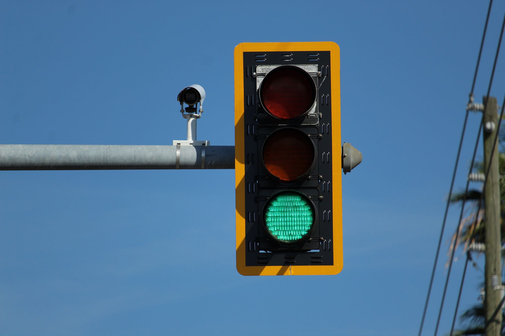
4.1.3: Status Messages
WCAG: Give real-time feedback to Assistive Technology (AT) users with clear but non-disruptive success and error messages.
IRL: Ever been behind a car with busted break lights? Not ideal. Brake lights serve as a status message informing drivers behind you when they need to slow down or stop. On the other hand, driving behind a car with, say, its emergency lights on for an extended period of time can be incredibly annoying.
Being not communicative enough or being overly communicative with alerts can cause disruptions to AT users’ workflow.

WCAG: In addition, make sure the app loading/waiting/progress statuses are communicated unambiguously and used robustly.
IRL: When we think about status messages, we can use traffic lights as a model. Green represents success, yellow represents warning, and red represents stop or error. We want to make sure these key operational signals are provided to all users, always.
TL;DR
Building digital to be accessible for all users is not exactly a simple task. There hasn't been enough research and examples (e.g., I've tried searching for days on an “accessible notification system” and still came up short).
But what I take away from these IRL examples is that the designers and builders of our physical world once had these exact same questions in mind. They figured it out, I imagine, with a healthy dose of empathy and ingenuity. At BetterUp, my coworkers and I hope to be pioneers, trialing, failing, and learning how to make our apps and softwares a delightful experience for all.
About the Author
Seema is a 2-time cancer survivor and woman of color. She enjoys writing code to make positive impacts in the world. She also enjoys hiking, barre, and making electronic music.


Join the conversation